Bruce Straley and Neil Druckmann, the directors and writer of the computer game “The Last of Us”, are games directors working for the developer Naughty Dog.
Bruce Straley:

Bruce Straley was the games director who co-directed The Last of Us, alongside Neil Druckmann. Straley began work in the games industry in the early 1990s, working as a designer for two games at Western Technologies Inc, two more at Pacific Softscape and one at Zono Incorporated. He has worked extensively on the popular Uncharted series, and is best known for his acclaimed work on The Last of Us.
Straley was employed at the developer Crystal Dynamics in the 1990s, where he worked alongside many future Naughty Dog employees; this included the co-president, Evan Wells. Straley joined Naughty Dog in 1999, and has remained there since. When he initially joined the company, working on the game Crash Team Racing, he performed many tasks outside of his job description due to the small size of the development team. From this, he learned various aspects of game development, which he later put to use on the Jak and Daxter series, being credited with creating the look of the games and bridging the gap between the technical and artistic teams. He was appointed the co-art director of Uncharted: Drake’s Fortune, and was then promoted to game director for Uncharted 2: Among Thieves.
Following Uncharted 2, Naughty Dog split their development into two teams, to work on two games at once. Straley was chosen to head one project, which became The Last of Us, alongside writer Neil Druckmann. They had worked together on Uncharted 2, and found that they had similar interests; they jokingly described their relationship as “like a marriage”, in that they had different ideas but were working for the same goal. Although he was officially in charge of gameplay, towards the end of development for The Last of Us Straley started performing other roles, described by the lead artist Nate Wells as “intern tasks”. Straley is best known for his work on The Last of Us, which was widely acclaimed by both critics and gamers.
Neil Druckmann:

Neil Druckmann was the co-director and writer of The Last of Us, working on the narrative while Bruce Straley focussed on gameplay. He was rasied in Israel until he was ten, where he showed great interest in both comic books and video games, particularly those by Sierra Entertainment and LucasArts. It is known that he took a particular interest in the storytelling aspect of both media. After studying Criminology in Florida, he worked as a research assistant in the Visualisation department of the Florida State Univerity School of Computing, where he developed his first game, called Pink Bullet, with some friends of his.
Druckmann’s parents forbade him from taking art classes required to become an animator, so he took a programming class, moving on to graduate with a Bachelor of Computer Science. He earned a Master’s Degree in Entertainment in 2005, developing “Dikki Painguin in: TKO for the Third Reich” for the obsolete NES with friend Adam Blomquist while studying.
Druckmann began work at Naughty Dog as a programming intern in 2004, graduating to a full time position a few months later. He asked repeatedly to be transferred to the design team, but was refused by co-president Evan Wells, who agreed to review his designs if they were completed out of working hours. He succeeded in impressing Wells, and was appointed designer for the first Uncharted game, ending up working closely with the writer on the core narrative as well as the design, and becoming lead designer on the sequel Uncharted 2. In 2009 and 2010, he created a motion comic based on Uncharted and published a graphic novel of his own writing, A Second Chance at Sarah. He was then chosen by Naughty Dog leadership to work on a new game with Bruce Straley, which eventually became The Last of Us.
The Last of Us was based on an idea he had as a student, of combining the gameplay from the game Ico with a zombie apocalypse, with the player character similar to John Hartigan from the film Sin City. His wife gave birth during development, with the resulting daughter being a “huge inspiration” to Druckmann. He took acting classes before recording the voice actors, to better engage with them while directing. For his work he earned multiple awards, including a BAFTA and a Writer’s Guild of America Award.
The Last of Us:
The Last of Us is set in the near future, and begins with an outbreak of a mutant strain of the fungus Cordyceps, creating what amounts to a zombie apocalypse. The player character must then escort his daughter, and later another woman, through the remains of civilisation, avoiding the decomposing remnants of the human race and those still alive who wish to do you harm. The majority of the gameplay is set 20 years after the opening, leaving time for infrastructure and civilisation to degrade to the extent shown on-screen.
The fungus shown in the game, Cordyceps, is a real fungus. It also has the effect of essentially rendering its host a zombie before bursting out of their head to spread spores. For the moment, and for the foreseeable future, these abilities are restricted to ants and other arthropods; many people actually eat the Cordyceps fungus as a homeopathic medicine (1). The chances of a random mutation allowing the fungus to do the same to human beings, vastly more complex and larger beings, is unlikely. It is not impossible, however, that biological warfare laboratories, being notoriously secretive and morally bankrupt, are researching something with effects similar to that shown in the game. In either case, the developers have clearly researched the fungus, both for the effects it has on hosts and the appearance of the hosts in the later stages of infection, with the fruiting body of the fungus erupting from their heads.
The level of decay on the buildings is, however, provably realistic. The majority of buildings in The Last of Us are overgrown with plant life, and are falling apart due to the lack of maintenance. This happens in real life when buildings are left abandoned for 20 years, as seen on Hasima Island in Japan. The island was built for a mining operation, but for a number of factors was abandoned once the mine was emptied, and the residents left the island in 1974. The ruins came to prominence in the 2000s. This was due to having been undisturbed for 30 years, and being built very similar to the city centre buildings of the time that were still in use on the mainland: the island gave a look at what the world would actually look like after an apocalypse. It is widely used by the media for this purpose, and the ruined landscape bears more than a passing resemblance to that of The Last Of Us.(2)
The Last of Us was widely critically acclaimed. Writer Neil Druckmann was given several awards for his writing, including a BAFTA and an American Guild of Writers awards, and the game itself is one of the highest awarded games of all time, and received very favourable critical reviews with both Metacritic and GameReviews scoring it at 95% or above. The games site IGN gave it a 10/10
(3), calling the game a “masterpiece”. I personally agree, and I find their vision of the future compelling; I do not find it at all hard to believe that biological warfare departments would create such a strain of fungus, and I find the human deterioration over 20 years believable.
1. http://www.webmd.com/vitamins-supplements/ingredientmono-602-cordyceps.aspx?activeingredientid=602&activeingredientname=cordyceps
2. https://en.wikipedia.org/wiki/Hashima_Island
3. http://uk.ign.com/games/the-last-of-us/ps3-123980


 John Roesch is another highly regarded foley artist, who works for both film and computer games. He is the lead foley artist for Warner Bros. Studios. Roesch worked on numerous high profile motion pictures, such as “Who Framed Roger Rabbit” and “The Abyss”, as well as video games such as “Dead Space” and “Final Fantasy X”.
 Bloome has started a studio based in New York,
  Alchemy Sound (5), that creates foley sounds. This studio has work for several current TV shows and Internet exclusive content, such as Making a Murderer for Netflix and Quantico for ABC. Alchemy Sound has also expanded to providing foley sounds for live productions and the sound for live events. They also provide the foley sounds for the recent video game Just Cause 3.
 Foley was originally a hardware store owner on the outskirts of Los Angeles, until the land was sold to the city for water rights. Foley was able to convince the new movie industry that his town would be perfect for filming westerns. He then found work on sound films, developing the art of foley sound. He worked on film like “Melody of Love” in 1928 and “Show Boat” in 1929. He received several awards for his work. Foley died in 1967. Foley was rarely credited in his films, as was the practice at the time; instead, generations have immortalized his name in the name of his art.

 Hideo Kojima is a Japanese video game designer, writer and director, best known for the Metal Gear Solid series of games. He has headed Kojima Productions, a video game design company, since 2005, and was once the vice-president of Konami Digital Entertainment. As of this writing, he has recently left Konami and reformed Kojima Productions as an independent company.
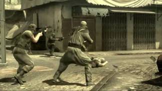 fighting shown to the player (on the left) takes place in the Middle East, where most of the notable fighting was happening in 2008, and where most of the notable fighting was likely to happen in the real 2014, an example of the effort put in to make the future shown at least semi feasible. The soldiers are enhanced with nano-machines, their weapons rejecting anyone who doesn’t have them in their blood, as shown when the main character attempts to use one. This vision of the future is dark, with constant warfare and death from around two minutes in until the credits roll.
 women who are all eating some form of confectionary. Suddenly, motorbike riders appear, and the focus shifts to the apparent brewing fight between the bikers (one of whom has a fake moose head stuck to his bike) and Macklemore on his moped, and abruptly switching focus again to the group dance-walking through the streets of Spokane. As they walk, most people they pass join their procession. A chariot then appears, made in the style of the American Eagle and pulled by motorbikes. There is a brief face-off between Macklemore and the bikers and the rider of the chariot before the dance-walking procession, now joined by motorbikes and mopeds, proceeds down the main street, watched by crowds and the people in the buildings on both sides.
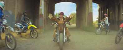 moral rules that ours does. The same style of ‘fighting’ is used, where the two sides only posture at each other with no actual fighting happening, and both sides are in the same procession at the end, so we can assume they came to some kind of agreement. The world shown, overall, is exactly what Rolling Stone said it was: charmingly ridiculous.
 notable is the rider of the chariot, who wears feminine clothing and hair but also a moustache, suggesting heavily that they are probably transsexual. This could be considered a very stereotypical presentation of a transsexual, with the flamboyant clothing and expression, but basically everyone acts like that in this video, and it fits the role that the character plays.
 cannot find much evidence of media commentary relating to the video; unlike Sexy and I Know It, the content of Beautiful World is not really a departure from the music videos normally shown in 1981, and Devo was far from a mainstream band. The extent of the controversy was some censoring that took place on the ABC music show Countdown: a scene in which a woman is engulfed in animated fire was considered too violent, and cut from the version broadcast.
 was made to reinforce the intended message of the song, because it is not entirely obvious that the singer is being sarcastic if given just the audio. The implication of the video is that the singer is lying to the character watching the television he appears on; Mothersbaugh is shot in black and white and directly faces the camera,
  his actions aggressive and vocal delivery strong and deliberate, to create a threatening image reminiscent of Big Brother from 1984 (pictured). The repeated insistence that “it’s a beautiful world” initially fits with the video used; the imagery of beautiful women and flowers fits well, but by the end of the video has given way to footage of World War One, African famines, car crashes and race riots to create dissonance and show clearly that the singer is not telling the truth.
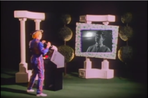 it is implied from the way Mothersbaugh stands that he can see the viewer. The character is absolutely shocked once the race riot footage appears, which suggests that he is entirely ignorant of anything outside of what the screen tells him, further supported by his childlike demeanor through the video.
 to turn the TV on, and then tweaked throughout the video. The watching character wears an odd jumpsuit looking thing, another part of the ‘future’ setting. This goes further again to suggest that the character lives in a world controlled by the TV; this would be technically possible in the time shown on screen, but not in the early 80s. There is too much iconography in the video to name all of it, but the main iconography is, as mentioned before, the ‘1984’ Telescreen used, to imply the sort of world that 1984 takes place in.
 wrong. Due to the video’s message, it is unclear whether the mildly sexist parts towards the middle, with the dancing girls, are sexist, as these begin appearing at around the same time as the war footage and bridges exploding and so forth. It is entirely possible that these are mildly sexist because that was the attitude of the filmmakers at the time the clips were made (the late 1950s to the 1960s, from the look of it).


 place famous for its bodybuilders and image-obsessed people, often both. It depicts the lead singer of LMFAO, accompanied by several friends and a robot, stealing the girlfriend of everyone on the beach via dancing, followed by a dance/’wiggle’ off to determine the victor. The video gives a message that a perfect body image is not required to be sexy; the singer and friends range from scrawny to slightly overweight, but they easily manage to steal girlfriends by dancing and ’being themselves’. The story is fairly simple, although there is action and conflict towards the end, in the form of the aforementioned ‘wiggle off’. The video as a whole is fairly upbeat and enthusiastic; no real aggression or violence is used during the narrative, and everyone seems to be enjoying themselves towards the end.
 rather than claustrophobic, despite the crowds and low ceilings. The fighting shown is almost entirely without malice; dirty looks are the most ill feeling really demonstrated here. All the ‘fighting’, additionally, actually looks quite fun to take part in, provided you like stripping to your underwear and shaking your crotch at the opposing team, while shouting “Wiggle, wiggle, wiggle, wiggle, wiggle, yeah!”